
Design by committee doesn’t work
 I was recently invited to give feedback about a billboard campaign that was ‘designed’ by a committee (I declined the invite). There was no need for them to tell me that their campaign was designed by a committee—that much was immediately obvious from a mile away. Here’s a little taste: the dominant (in the worst possible meaning of that term) feature on those billboards was the traditional “power pose” – aka, talking heads.
It’s an archaic approach, and more often than not, still used only by people whose aim is to quickly disparage someone or something (i.e. the kind of folks who design and pay for billboards like the one shown on the right), not to inspire positive change.
Here’s a little 101 on designing advertisements: a. Whenever we take a look at something, (could be anything really) we never look at it just with our eyes—we always look at it with our memories too. And what do you think our memories see when they see talking heads on a billboard? b. The pulling power of an advertisement is usually determined at a glance.
Let’s do a 180 and study the winners. (For business-building ideas that last, always study the winners.)
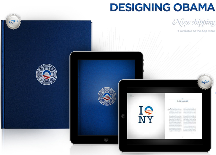
If you want to learn more about design and one of the most successful marketing campaigns in history, I encourage you to try to get your hands on a copy of the book titled Designing Obama. (Please note: The 360-page, hardbound, full-color book, which I prefer to digital copies, is currently sold out.)
It’s a remarkable collection by Scott Thomas, the Design Director for the Obama campaign, and features forewords by Steven Heller and Michael Beirut (one of my all time favourite designers).
My 2¢:
In life and in business, how you tell your story matters. But don’t take my word for it—just ask Obama.
P.S.
Ever wondered why the so called design-by-committee concept is still around?
In short, to spread the risk so that no single person is accountable for the end result(s) or the lack thereof.